replaced http://meta.stackoverflow.com/ with https://meta.stackoverflow.com/
Source Link

SE will be doing this on the smaller sites eventually. And well, some of the issues people have with it feel feels a bit like

enter image description here
source:xkcd

It also actually takes up less vertical space and uses horizontal space better (It dosen't use more, but moves things around a bit. Feels bigger to me)

enter image description here

And probably brings with it customisable tabs (and I will certainly be complaining loudly if we don't).

There's a bit of a learning curve (and when this hits SU, If the TPTB don't, I'll probably dig through and do a quick meta post on this - and if it hits here first, I might try it here first) but "disgusting, unergonomic, suboptimal. And it is fixed to the top" is 3/4 unclear and 1/4 wrong. If there's specifics you are unhappy with, go tell SE on MSO. We're pushing for a few things we need like help links on the top bar for all usershelp links on the top bar for all users

Now, I don't like the newfangled white theme, and some sites are going to be a agony in the donkey to do but this seems a bit hyperbolic.

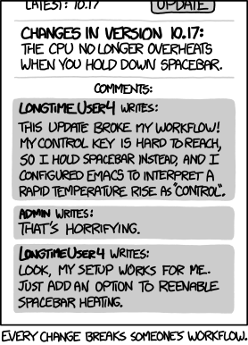
SE will be doing this on the smaller sites eventually. And well, some of the issues people have with it feel feels a bit like

enter image description here
source:xkcd

It also actually takes up less vertical space and uses horizontal space better (It dosen't use more, but moves things around a bit. Feels bigger to me)

enter image description here

And probably brings with it customisable tabs (and I will certainly be complaining loudly if we don't).

There's a bit of a learning curve (and when this hits SU, If the TPTB don't, I'll probably dig through and do a quick meta post on this - and if it hits here first, I might try it here first) but "disgusting, unergonomic, suboptimal. And it is fixed to the top" is 3/4 unclear and 1/4 wrong. If there's specifics you are unhappy with, go tell SE on MSO. We're pushing for a few things we need like help links on the top bar for all users

Now, I don't like the newfangled white theme, and some sites are going to be a agony in the donkey to do but this seems a bit hyperbolic.

SE will be doing this on the smaller sites eventually. And well, some of the issues people have with it feel feels a bit like

enter image description here
source:xkcd

It also actually takes up less vertical space and uses horizontal space better (It dosen't use more, but moves things around a bit. Feels bigger to me)

enter image description here

And probably brings with it customisable tabs (and I will certainly be complaining loudly if we don't).

There's a bit of a learning curve (and when this hits SU, If the TPTB don't, I'll probably dig through and do a quick meta post on this - and if it hits here first, I might try it here first) but "disgusting, unergonomic, suboptimal. And it is fixed to the top" is 3/4 unclear and 1/4 wrong. If there's specifics you are unhappy with, go tell SE on MSO. We're pushing for a few things we need like help links on the top bar for all users

Now, I don't like the newfangled white theme, and some sites are going to be a agony in the donkey to do but this seems a bit hyperbolic.

added 63 characters in body
Source Link

SE will be doing this on the smaller sites eventually. And well, some of the issues people have with it feel feels a bit like

enter image description here
source:xkcd

It also actually takes up less vertical space and uses horizontal space better (It dosen't use more, but moves things around a bit. Feels bigger to me)

enter image description here

And probably brings with it customisable tabs (and I will certainly be complaining loudly if we don't).

There's a bit of a learning curve (and when this hits SU, If the TPTB don't, I'll probably dig through and do a quick meta post on this - and if it hits here first, I might try it here first) but "disgusting, unergonomic, suboptimal. And it is fixed to the top" is 3/4 unclear and 1/4 wrong. If there's specifics you are unhappy with, go tell SE on MSO. We're pushing for a few things we need like help links on the top bar for all users

Now, I don't like the newfangled white theme, and some sites are going to be a agony in the donkey to do but this seems a bit hyperbolic.

SE will be doing this on the smaller sites eventually. And well, some of the issues with it feel feels a bit like

enter image description here

It also actually takes up less vertical space and uses horizontal space better (It dosen't use more, but moves things around a bit. Feels bigger to me)

enter image description here

And probably brings with it customisable tabs (and I will certainly be complaining loudly if we don't).

There's a bit of a learning curve (and when this hits SU, If the TPTB don't, I'll probably dig through and do a quick meta post on this - and if it hits here first, I might try it here first) but "disgusting, unergonomic, suboptimal. And it is fixed to the top" is 3/4 unclear and 1/4 wrong. If there's specifics you are unhappy with, go tell SE on MSO. We're pushing for a few things we need like help links on the top bar for all users

Now, I don't like the newfangled white theme, and some sites are going to be a agony in the donkey to do but this seems a bit hyperbolic.

SE will be doing this on the smaller sites eventually. And well, some of the issues people have with it feel feels a bit like

enter image description here
source:xkcd

It also actually takes up less vertical space and uses horizontal space better (It dosen't use more, but moves things around a bit. Feels bigger to me)

enter image description here

And probably brings with it customisable tabs (and I will certainly be complaining loudly if we don't).

There's a bit of a learning curve (and when this hits SU, If the TPTB don't, I'll probably dig through and do a quick meta post on this - and if it hits here first, I might try it here first) but "disgusting, unergonomic, suboptimal. And it is fixed to the top" is 3/4 unclear and 1/4 wrong. If there's specifics you are unhappy with, go tell SE on MSO. We're pushing for a few things we need like help links on the top bar for all users

Now, I don't like the newfangled white theme, and some sites are going to be a agony in the donkey to do but this seems a bit hyperbolic.

edited body
Source Link

SE will be doing this on the smaller sites eventually. And well, some of the issues with it feel feels a bit like

enter image description here

It also actually takes up less vertical space and uses horizontal space better (It dosen't use more, but moves things around a bit. Feels bigger to me)

enter image description here

And probably brings with it customisable tabs (and I will certainly be complaining loudly if we don't).

There's a bit of a learning curve (and when this hits SU, If the TPTB don't, I'll probably dig through and do a quick meta post on this - and if it hits here first, I might try it here first) but "disgusting, unergonomic, suboptimal. And it is fixed to the top" is 3/4 unclear and 1/4 wrong. If there's specifics you are unhappy with, go tell SE on MSO. We're pushing for a few things we need like help links on the top bar for all users

Now, I don't like the newfangled blackwhite theme, and some sites are going to be a agony in the donkey to do but this seems a bit hyperbolic.

SE will be doing this on the smaller sites eventually. And well, some of the issues with it feel feels a bit like

enter image description here

It also actually takes up less vertical space and uses horizontal space better (It dosen't use more, but moves things around a bit. Feels bigger to me)

enter image description here

And probably brings with it customisable tabs (and I will certainly be complaining loudly if we don't).

There's a bit of a learning curve (and when this hits SU, If the TPTB don't, I'll probably dig through and do a quick meta post on this - and if it hits here first, I might try it here first) but "disgusting, unergonomic, suboptimal. And it is fixed to the top" is 3/4 unclear and 1/4 wrong. If there's specifics you are unhappy with, go tell SE on MSO. We're pushing for a few things we need like help links on the top bar for all users

Now, I don't like the newfangled black theme, and some sites are going to be a agony in the donkey to do but this seems a bit hyperbolic.

SE will be doing this on the smaller sites eventually. And well, some of the issues with it feel feels a bit like

enter image description here

It also actually takes up less vertical space and uses horizontal space better (It dosen't use more, but moves things around a bit. Feels bigger to me)

enter image description here

And probably brings with it customisable tabs (and I will certainly be complaining loudly if we don't).

There's a bit of a learning curve (and when this hits SU, If the TPTB don't, I'll probably dig through and do a quick meta post on this - and if it hits here first, I might try it here first) but "disgusting, unergonomic, suboptimal. And it is fixed to the top" is 3/4 unclear and 1/4 wrong. If there's specifics you are unhappy with, go tell SE on MSO. We're pushing for a few things we need like help links on the top bar for all users

Now, I don't like the newfangled white theme, and some sites are going to be a agony in the donkey to do but this seems a bit hyperbolic.

Source Link
Loading