We get a LOT of seriously off-topic questions on ServerFault.
This is because new users either can't comprehend the word 'server' in the site name or because they skipped the old, and very clear, FAQ.
So when new users asked eight-word 'questions' about their home routers, recommendations for what was the latest, greatest motherboard or about their fishtank pump we could at least respond with a quick "please read the FAQ".
This is no longer an option - we now have to respond with "please exhaustively read the entire help tree" - which I've not managed to do yet.
I believe the idea behind these changes is to make the place more 'welcoming', well it will be in that new users won't have any obvious actual help and will litter the site with these inappropriate questions.
Worse yet they'll go unanswered and unedited as those users with experience of the site, who put a lot of time into it, will leave or reduce their time on the site because of the lowered signal to noise ratio that's been introduced without any discussion between the site owners and those doing the actual work. I thought this site was supposed to be a community, guess we've just seen that that was never the case.
=== EDIT ===
We're seemingly more inundated than ever with inappropriate questions from new users - it's easy to see why.
This is the top of the first page new users see - the text about 'pro system....' is WAY too small and out of the way - it needs to be FRONT AND CENTRE, in BOLD and in RED text so that it can't pass people by. I suggest it goes between the buttons at the top and the 'how it works' block below.

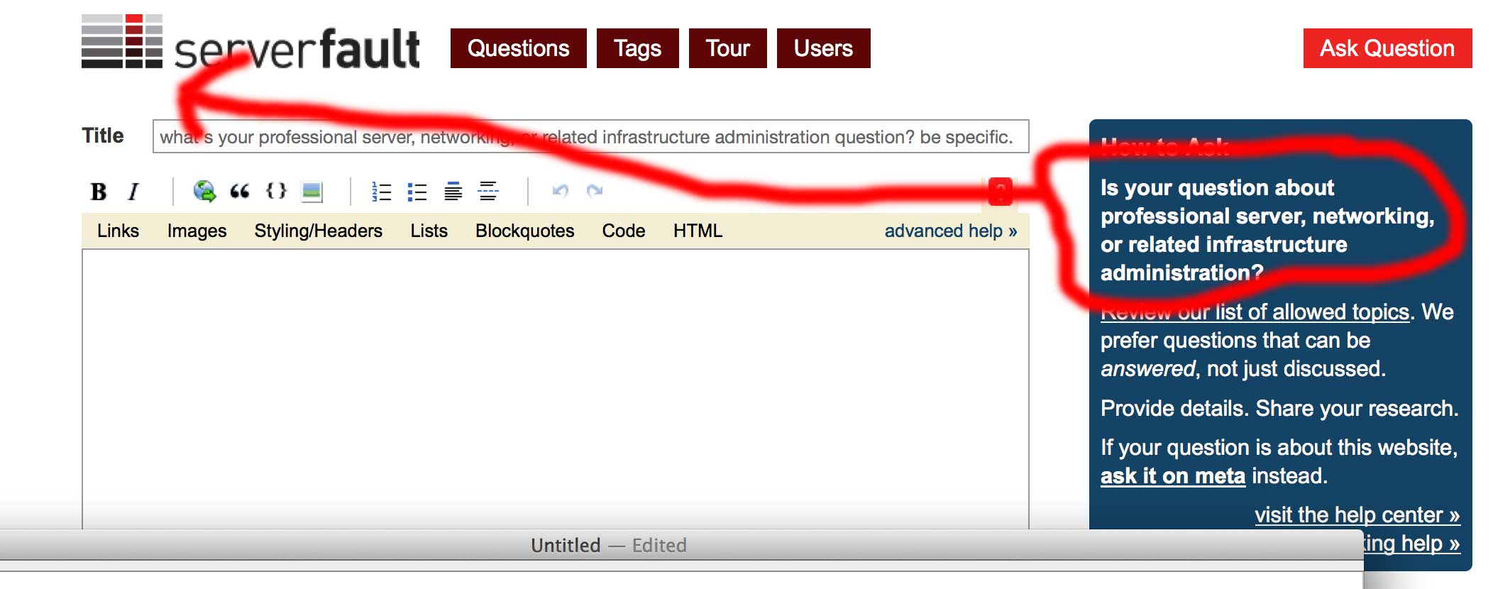
So then if they ignore that and just blindly hit 'Ask Question' they get this;

Lots of white text, some of it important, some of it not - hidden away on the right and VERY easy to ignore. Again let's move the circled text over beneath the buttons, in bold and red so that they have to be doubly-stupid to have missed it. It won't get them all - we get some real idiots - but we're making it way to easy for new users to get confused.
Can we change this?
