0

We rolled out the new site theme for Server Fault. It is now live.

What new theme?

If you're like, "What the heck are you talking about?", then you should read the Meta Stack Exchange post entitled Rollout of new network site themes (and maybe the posts it links to for the full background).

Your help needed

You are one of the first sites to get a new, unified theme. I previously posted the designs for theme in meta. The feedback given to that post was considered prior to rolling out the theme. Please help us look for issues/bugs and post the details (including images where needed) as an answer below.

If you have concerns or issues regarding the left nav then this Meta Stack Exchange post is the right place for feedback. If you have issues with any functionality that is unrelated to the new theme, then please post a new question.

2
  • 2
    I'm kind pleased I don't play the SF game much any more. I'm not sure I could spend much time looking at it. It's a bit washed out and in other ways visually jarring.
    – user9517
    Commented Aug 11, 2018 at 20:17
  • Related bug, meta.serverfault.com/questions/9356/…
    – yagmoth555 Mod
    Commented Aug 13, 2018 at 16:46

6 Answers 6

13

OK, after actually having used it now on the only site I frequent:

This new layout is absolutely no improvement in any way compared to the old version. Actually, for me it is a lot less usable than the old version and I don't understand at all how you came to the conclusion this should be going live.

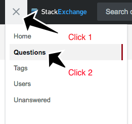
What's bothering me? The new 3rd column. It serves no useful purpose at all and just uses valuable horizontal space that could be much better used for the actual question/answer text (to avoid scrolling for long code blocks...). Yes, I know I can turn it off. Only, then I loose my convenient way to access the newest question view of the start page and either have to use the bookmark in the toolbar or click twice, once on the burger menu and then on "questions". I use only this link to get back to the homepage (which for me, is the "newest question view"), and I do this many dozens of times a day.

  • Old view:

    enter image description here

  • New view:

    enter image description here

Yes, I know every change breaks someones workflow, but this change brings no improvement for anyone, so it really has no reason to exist.

6

We can't collapse the top bar and site header into one since we need to maintain the Stack Exchange branding and provide clear visibility regarding which site you're on.

There's a lot of apparently wasted white space on the home page, as compared to Stack Overflow's home page. Hopefully we'll get the compacted top bar someday?

Home page

Stack Overflow


This could be compacted even a little bit, like so

I just moved one div and didn't even touch the CSS

5
  • The missing space seem due to a missing logo on the top right corner, please check Joe original image there; i.sstatic.net/wZSLL.png The logo is not there on the current design, but the spacing is
    – yagmoth555 Mod
    Commented Aug 9, 2018 at 16:27
  • 1
    Hm, I see the example of the background image. But I think that should just be cut out entirely. Commented Aug 9, 2018 at 16:28
  • I see this has been closed as "by design". It's always nice to have our comments ignored every time there's a design change... (sorry Joe but that's what it feels like). I understand the need to maintain branding but that truly is an awful lot of screen estate being wasted.
    – Rob Moir
    Commented Aug 9, 2018 at 19:12
  • At least find some use for the whitespace. Some of the rest of this stuff can be collapsed, I'm sure. Commented Aug 9, 2018 at 19:14
  • I don't see any reason why "Top Question" and "ask question" couldn't go in the same bar as the logo, for example, agreeing with @MichaelHampton
    – Rob Moir
    Commented Aug 9, 2018 at 19:26
3

The font/color for visited links both in comments and questions/answers is barely distinguishable from normal text:

It's especially bad for commments:

  • Unvisited link:

    enter image description here

  • Visited link

    enter image description here

but questions/answers aren't much better:

  • Unvisited link:

    enter image description here

  • Visited link:

    enter image description here

This should be changed.

2

In the live site the spacing in the top bar its empty, at the right of the serverfault logo, but in the proposed theme I see a logo in the top right space, like small cube.

Is it a error?

To add an image, this drawing is missing in the live site:

enter image description here

2
  • People seemed to be mixed on these design flourishes, so we pulled them. We can add them back in if there is strong support.
    – Joe Friend
    Commented Aug 13, 2018 at 19:13
  • @JoeFriend I like the logo, it make a good branding like on MSE. The fact there is none people want to cut that space to have the same look and fell than SO, so I doubt I will get the support to bring the logo back.
    – yagmoth555 Mod
    Commented Aug 14, 2018 at 14:01
2

SF is a lot more blue than it used to be. (I also noticed this on Ask Ubuntu, so it seems to not be just us.)

Numerous visual elements that were gray, yellow or red, such as tags and user cards, and most especially links to questions, have suddenly become blue.

It's getting a little strange. I keep thinking I'm on some other network site.

Question links are blue:
Blue links to questions

Tags and user cards are blue:
Blue tags and user cards

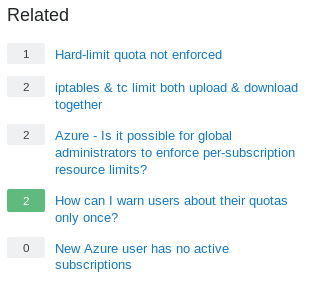
Related questions have turned blue:
Blue related questions

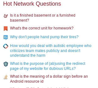
Some Hot questions links are blue:
Blue hot questions links

3
  • This has been addressed and should be fixed in production. Things should be looking a lot more consistent now! Commented Aug 15, 2018 at 22:02
  • @AaronShekey Yes, I saw the change go live an hour or two ago. There's almost no blue left now. I think I did see a few last remaining bits though... like .bounty-indicator-tab Commented Aug 15, 2018 at 22:17
  • Curiously, if you visit the wayback machine in July, there was a ton of blue on the site, but I think it makes good sense to unify on the primary red color. ¯_(ツ)_/¯ Commented Aug 15, 2018 at 22:18
0

This is not related to theming and would require a major investment to make work on each of the network sites.

I would add the menu Interesting in the question list if not too late for that.

It's a nice feature as it filter with the watched tag's feature the question list.

As seen on StackOverflow;

enter image description here

1
  • @JoeFriend It could act like a simple search intags:mine, so we will have the same design layout than SO. It would make of use of the watched tag function, as the ignore tag already allow to hide ignored tag questions. I agree the AI under the hood on SO for that feature is way out of question, but we can agree the watched tag category is a lot more useful on SO because of such feature.
    – yagmoth555 Mod
    Commented Aug 10, 2018 at 2:14

You must log in to answer this question.

Not the answer you're looking for? Browse other questions tagged .