30

Hello Server Fault community,

I want to give you a heads up that I'll be making some minor design updates to SF site design to reflect recent changes on Stack Overflow and Super User. Visually it should "feel" the same as the old site with slight layout adjustments.

We are moving the site's CSS to a newly refactored LESS system, so that it's easier for us to fix SE network CSS bugs globally and launch new features in the future.

The new icons and site logo will be in svg for retina support too.

This update should retro-actively fix most of the old design bugs. If you see any new ones, or old ones not yet fixed, please post an answer here to let us know!

ETA for new design launch will be this evening EDT.

Edit: we have just launched the new design update. It is now live.

10
  • 21
    MY CHEESE! IT'S BEING MOVED! PANIC :-P
    – voretaq7 Mod
    Commented Mar 19, 2015 at 18:34
  • 1
    I'm looking forward to seeing if my pet long-standing UI bug gets fixed.
    – sysadmin1138 Mod
    Commented Mar 19, 2015 at 19:55
  • 5
    I'm having a really hard time telling the difference between SF and SO, visually, if I've scrolled down a page and can no longer see the header.
    – Michael Hampton Mod
    Commented Mar 20, 2015 at 14:04
  • 4
    And I'm not sure that having all the links in bright blue quite fits. Sure it's easier to see the links now, but it clashes with the otherwise red-themed site.
    – Michael Hampton Mod
    Commented Mar 20, 2015 at 18:40
  • 1
    If you have favourite tags, the blue on beige is not pleasant at all.
    – user9517
    Commented Mar 22, 2015 at 21:12
  • 1
    the light blue text needs to be darker. It hurts the eyes on smaller and less fancy laptop screens
    – dyasny
    Commented Mar 26, 2015 at 18:23
  • Looks like this logo bug related to this new design
    – masegaloeh
    Commented Mar 27, 2015 at 12:23
  • meta.serverfault.com/q/8090/126632
    – Michael Hampton Mod
    Commented Apr 15, 2015 at 16:21
  • wow, no longer look like a '90 website. I'am shock.
    – yagmoth555 Mod
    Commented Apr 21, 2015 at 2:39
  • meta.serverfault.com/questions/8209/sf-layout-answer-coloring Seem UI look ok on a blackberry, while not ok in IE, Chrome & Firefox.. Point me to a UI error, not a wanted behavior.
    – yagmoth555 Mod
    Commented Oct 8, 2015 at 16:17

11 Answers 11

26

Two words: readability sucks.

Gray fonts, bleached colors, buttons that can be lost to sunglare. Not fun, and certainly not easy to read.

2
  • 7
    I suppose this is largely a less diplomatic version of my complaint regarding the reduced contrast of the new color scheme. I'll just point out that I do agree, in case someone mistakes my less harshly worded answer for it not being a big deal to me. Commented Mar 22, 2015 at 16:22
  • 1
    Even though these replies have been on for a while and have the most upvotes, they have been completely ignored. How's that for a community confidence booster?
    – dyasny
    Commented Apr 22, 2015 at 16:11
16

I feel that the fairly big jump in colors, towards a color scheme with markedly less contrast is less comfortable compared to the old design.

I'm primarily referring to the blue links which have now become a much lighter blue nuance. I would say that what is currently the 'visited' color would be much better as the main color for links, while I think the current 'hover' color is outright too light to go with a white background.

For the sake of people who primarily answer questions and spend time on pages with listings of questions (where the bulk of the page contents is link text), I think it would be better to go with a more utilitarian approach over what I presume is purely a design decision.

1
  • 2
    +1 on this one. Especially on LCD screens viewed at suboptimal angle
    – dyasny
    Commented Mar 26, 2015 at 21:48
15

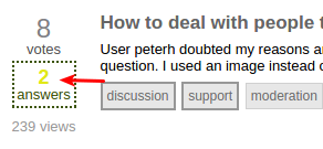
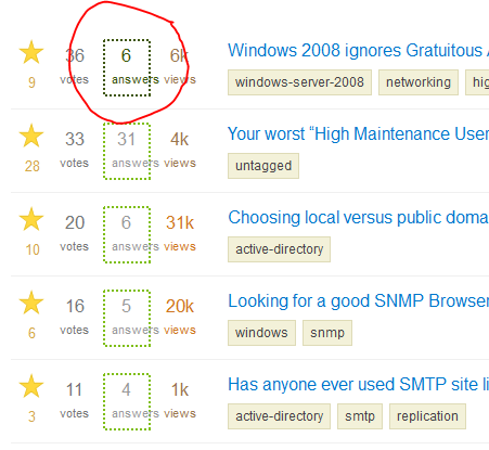
So that this is crystal clear:

Accepted answers do not have an outline, or a different color, while non accepted answers have a box around the number of votes.

Notice that the ones with a box were not accepted, and the ones without a box are accepted. This is confusing, to say the least.

enter image description here

2
  • 9
    That is indeed very confusing. To the point where I had to read the explanation twice...
    – Reaces
    Commented Mar 31, 2015 at 6:39
  • 1
    This finally got fixed.. today.
    – Michael Hampton Mod
    Commented Aug 9, 2018 at 15:34
11

The new layout has a bug in the "tab bar" on Firefox 36/Mac. Note the small bumps in the horizontal line. They don't appear on Safari or Chrome.

enter image description here

On a fresh profile without any modificatons at all, it looks a bit different, but this changes when zooming in/out:

enter image description here

I just noticed the effect can also appear when zooming on Safari and Chrome.

4
  • do you have a custom font size set in firefox? e.g. set minium font size etc.
    – Jin
    Commented Mar 20, 2015 at 8:22
  • I might have zoomed a bit or something, but see my edit.
    – Sven Mod
    Commented Mar 20, 2015 at 8:28
  • 3
    I can reproduce this. I'll put a fix for it soon.
    – Jin
    Commented Mar 20, 2015 at 8:30
  • 1
    @Jin: It's still not fixed, a month later. Any update?
    – Sven Mod
    Commented Apr 22, 2015 at 19:42
10

WAH, the profile page can't haz any background color for accepts, accepted answers, the upvotes are black, where did I just get?

(obviously taken from the profile page of ewwhite)

10

There are some strange color choices for the moderator links in a user's profile.

Orange and brown? What is this, Ask Ubuntu?

6

It looks like you missed one of our outstanding design issues. The yellow on white in the /questions list for questions with accepted answers is hard on the eyes.

The yellow on white Hurts the eyes

4
  • I think you were still looking at the old design. The new design just launched to live(both on main and meta)
    – Jin
    Commented Mar 20, 2015 at 8:15
  • 2
    Ah right, I was working off the statement ETA for new design launch will be this evening EDT which should have had it up and running before I was awake in GMT tomorrow ;)
    – user9517
    Commented Mar 20, 2015 at 8:18
  • 3
    np! I did launch the site later than I wanted to. I just wanted to do more testing before I sent it off
    – Jin
    Commented Mar 20, 2015 at 8:19
  • 2
    Cheers, it's much improved and much appreciated.
    – user9517
    Commented Mar 20, 2015 at 8:21
6

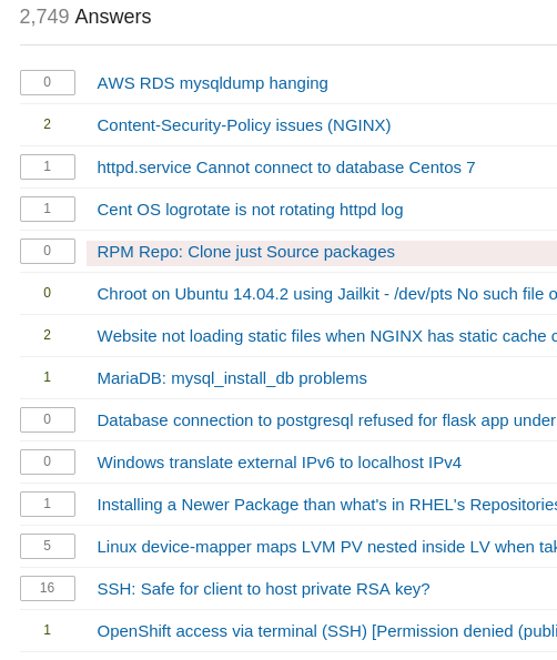
Whilst doing a bit of research for the yellow on white issue I noticed something else which doesn't seem right. I searched for questions with accepted answers and was greeted with this

Ugh! the dots

The dots are wrong, the double dots are fugly. It's the same on the main SF site too. I checked on [SU] and [SO], they don't have nasty looking double dotted boxes.

1
  • 2
    It should be fixed now.
    – Jin
    Commented Mar 20, 2015 at 8:15
5

I'd like to reiterate what @Hakan already said - the new colours are less readable by several degrees, I have to strain to read the screen, when before, I could cross read the entire set of questions in a second. Please make the light blue darker again.

4

First of all, let me tell you that i absolutely love the new design. It's soooo cool, looks very clean and appealing to me!

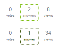
What has always confused me, but still is very confusing and also very badly visible are the dotted borders around the Answers.

enter image description here

  • The light green boder-color is hardly distinguishable from the black border-color.
    I would propose the answered questions get a solid border, a light background, anything that makes them distinguishable.
  • When hovering over the black-dotted box, a label appears "one of the answers was accepted …".
    When hovering over the green-dotted box, no label appears. It would be helpful to have that label with an explanation what the green-dotted means.
  • Unrelated to the dotted boxes, but related to the missing explanation: What are those light yellow tinted questions? (answered) Maybe the layout could be enhanced to give an explanation anywhere?
2
  • 1
    If you have favourite tags, questions with those tags are highlighted - is that what you're seeing ?
    – user9517
    Commented Mar 23, 2015 at 20:30
  • Oh cool, finally I know! :)
    – Daniel
    Commented Mar 24, 2015 at 7:09
4

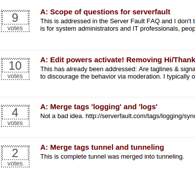
As noted on a separate question,

I'm not sure how this should look, but I'm fairly sure that it shouldn't look like this.

I'm running Windows 7, Firefox 37.0.1

enter image description here

4
  • what browser and OS?
    – Shog9
    Commented Apr 15, 2015 at 18:06
  • It looks the same on FF37/Mac and Chrome/Mac.
    – Sven Mod
    Commented Apr 15, 2015 at 18:43
  • Same for me, Win7 / Chrome Version 41.0.2272.118 m Commented Apr 15, 2015 at 19:05
  • Yes, this look seems to be consistent across browsers and OSes. (Chrome 41, Firefox 37 on Windows and OS X, IE 11 on Windows) Commented Apr 15, 2015 at 19:15

You must log in to answer this question.

Not the answer you're looking for? Browse other questions tagged .