8

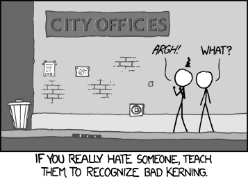
I was reading the serverfault.com blog today using Firefox - normally I just consume the RSS and read it from my reader. I was shocked at how bad FF was as at kerning the h3 headers. In Chrome and IE9 it is legible, though many of the letters still actually touch.

The source of the rule is in style.css line 61 (at the time of this posting) and the offending property is letter-spacing. I would like to suggest getting rid of letter-spacing entirely, though experimenting with the text-rendering or other attributes might be of value.

Maybe there is another way to get the desired effect? For example I changed the rule locally to be:

letter-spacing: -0.01ex;
text-rendering: geometricPrecision;

And it helped quite a bit, while still tightening up the kerning. Other thoughts? Is there a better place to talk about this?

A couple of references:

Update: While I still maintain the negative letter-spacing makes the heading look worse than letter-spacing: auto, I did some additional comparisons and FF on XP is by far the worst. On Win7 all three browsers look pretty close to the same.

Bad Kerning on FF1 on WinXP

Disclaimer: I recognize I am being excessively picky.

5
  • Are you @vortaq's sockpuppet?
    – Scott Pack
    Commented Apr 2, 2012 at 23:26
  • Nope - but do you mean @voretaq7?
    – Goyuix
    Commented Apr 3, 2012 at 0:32
  • @ScottPack Also, mispelled keming.
    – jscott
    Commented Apr 3, 2012 at 0:37
  • I find both variants (IE's as well as FFs) rather displeasing to look at. It is not like Firefox is doing specifically badly there. BTW: in Opera it looks much more readable, but yet shitty.
    – the-wabbit
    Commented Apr 3, 2012 at 15:40
  • @syneticon-dj The kerning in Firefox is extraordinarily bad - It is readable, but far from ideal. At least IE has managed to make each letter separate and distinct...
    – voretaq7 Mod
    Commented Apr 3, 2012 at 16:19

3 Answers 3

8

Fix it! Fix it! Fix it! Fix it! Fix it! Fix it!
Bad Kerning!
Fix it! Fix it! Fix it!

3

Two points:

  1. I didn't know (or had totally forgotten) there is a blog.
  2. You're right about it looking crappy in FF on XP. The letters look like they're being just a little too friendly with each other, with some of them looking like they might be mating.
2
  • (1) is why the blog keeps usurping the chat link's place in the header..
    – voretaq7 Mod
    Commented Apr 3, 2012 at 15:07
  • @vortaq7, I only ever see chat in the header, although I admit I generally only look up there to click on meta. Commented Apr 3, 2012 at 22:42
2

This is a problem with FF, using the suggested modifications would adversely effect every other browser.

We are looking at a complete redesign in the future for the blog though

1
  • 1
    I find it odd that I don't see the same issue with other sites, using the same browser and OS. Commented Apr 3, 2012 at 22:45

You must log in to answer this question.

Not the answer you're looking for? Browse other questions tagged .